



A reflective finish can overpower the information it is supposed to sell. Here is how to specify white ink, choose type and colors, and test a holographic package before production.
Shine hides mistakes. When a holographic carton looks sharp in a screen mockup but loses its product name beneath a retail spotlight, the failure often begins with an artwork decision that treated a shifting reflective surface as ordinary white paper. What good is shelf impact if the customer cannot read the label?
My starting point for holographic paper printing is simple: give essential text a stable background, use sufficiently opaque ink where the holographic effect must stop, and approve the finished material under realistic lighting. Font choice matters, but it cannot compensate for disappearing contrast.
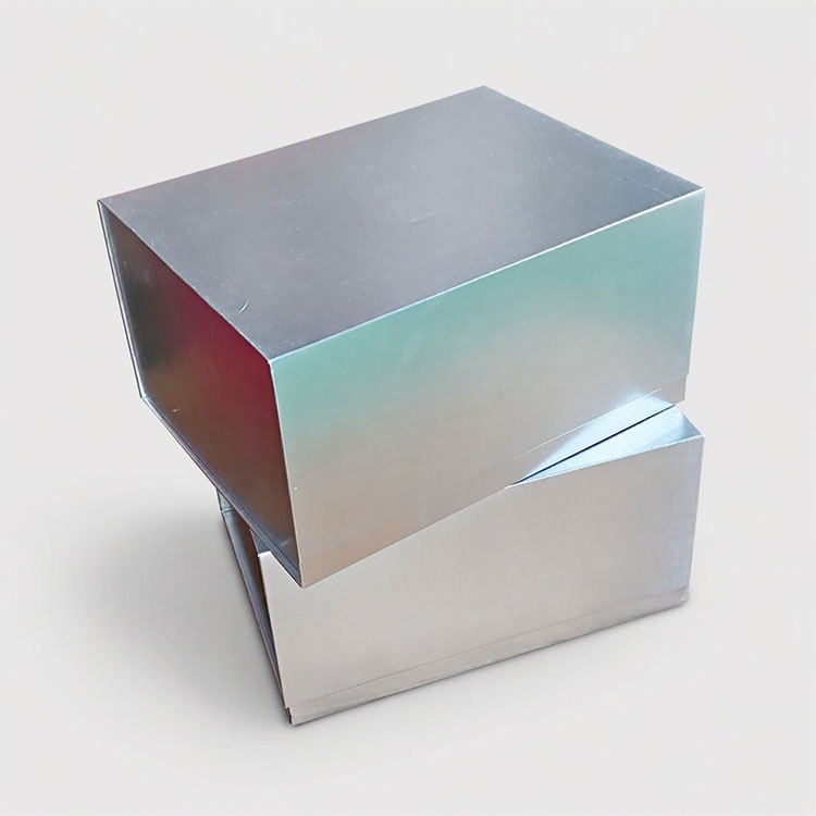
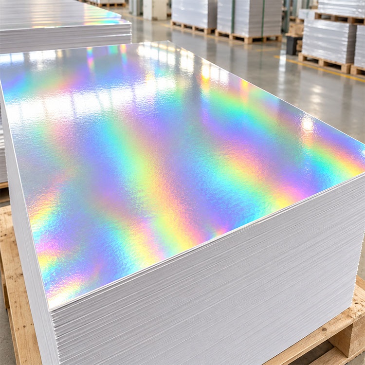
The microstructured surface of holographic paper for custom packaging diffracts light, producing colors that shift with illumination and viewing angle. The background behind a word therefore changes as someone turns the box.
That is the design problem. A color pairing that looks distinct in one photograph may become difficult to separate in another position.
A 2023 packaging study hosted by Rochester Institute of Technology included 13 visually impaired participants in Zagreb. Within that study, contrast between lettering and background had the greatest influence on readability; font type had the least. The small sample does not establish a universal ranking, but it gives us a reason to fix the background before debating typefaces.
別の French supermarket study indexed by the U.S. National Library of Medicine, published in April 2016, tested 196 shoppers aged 18–82 reading four food packages. Mandatory and nutritional information proved less legible than promotional information, and older shoppers performed worse. The authors also reported metallic lettering becoming harder to read under store lighting than during a natural-light pretest.
Neither study establishes a holographic printing specification. My inference is narrower: packaging readability deserves a physical test in its intended environment.
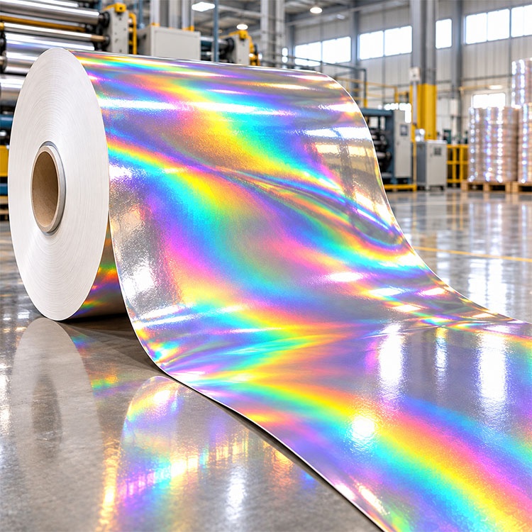
~とともに CMYK printing on holographic paper, transparent color can allow the reflective substrate to contribute to the result. A white ink underbase creates a more opaque foundation beneath selected artwork.
And white space in a CMYK file is not white ink. Without a separately specified white printing channel, an unprinted area exposes the stock.
In Nissha Metallizing’s documented chocolate-box example, the designer specified 100% spot white beneath areas intended to block the metallic background and 30% spot white beneath gold intended to retain some shimmer. Other areas received no white.
That is a useful demonstration of selective control. It is not a recipe that guarantees the same appearance on another press or substrate.
For a white ink underbase for holographic printing, I would request the following comparison on the proposed production stock:
| Proposed proof variant | Intended effect | What to inspect |
|---|---|---|
| CMYK with no white beneath | Strong interaction with the holographic surface | Whether lettering disappears as the sample moves |
| CMYK over 50% spot-white tint | A compromise between shimmer and separation | Unevenness, visible screening, and weak text contrast |
| CMYK over 100% spot white | A more isolated background for text and color | Residual show-through, pinholes, and edge registration |
| CMYK over two hits of solid white, if compatible | Greater hiding power where one hit is insufficient | Added opacity, ink buildup, curing, and fine-detail reproduction |
These are proposed test variants, not measured results. A 50% tint does not mean 50% optical opacity, and 100% spot white does not guarantee complete hiding.
NovaVision’s holographic paper guidance specifically describes two hits of opaque white beneath color-sensitive areas. Ask the printer whether that approach suits its ink system, then compare the physical result and itemized cost.
I would keep instructions, ingredients, product identifiers, and other essential copy on a deliberately quiet panel. Reserve exposed holographic areas for decoration or graphics that can tolerate changing appearance.
My shortlist for testing the best fonts for holographic paper would include Arial, Helvetica, and Source Sans 3 in regular or medium weights. These are starting candidates, not winners established by a holographic-paper study.
Compare their actual printed letterforms. Check lowercase x-height, open counters, spacing, and distinctions between I, l, and 1 または O and 0.
For a development proof, I would include 8 pt, 10 pt, and 12 pt versions of representative copy. That is a comparison ladder, not a legal minimum or an accessibility guarantee. If the smaller version is difficult to read, increase the space allocated to information.
Thin scripts, tightly condensed lettering, and delicate reversed text would need particularly convincing physical proofs before I approved them.
その best colors for holographic paper printing depend on whether the aim is readable information or a metallic visual effect.
For essential copy, I would first test black or deep navy over a sufficiently opaque white panel. For decorative areas, I would compare translucent colors over exposed holographic stock. Pale gray, yellow, or pastel lettering directly over a shifting background would receive extra scrutiny.
For small black text on an opaque panel, ask prepress whether C0 M0 Y0 K100 is appropriate. A black built from several process colors adds separations that must register accurately.
If brand color matters, use a Pantone matching and packaging approval checklist to define the reference, substrate, finish, and acceptance method. A Pantone code alone does not describe the optical behavior of a holographic background.
The useful question is not simply whether a printer can put ink on the sheet. It is whether the proposed material, ink, artwork, and finishing sequence produce readable packaging together.
I would put these requirements into the production brief:
使用方法 packaging artwork design and prepress support to coordinate those requirements with the dieline and finishing layers. A PDF remains useful for checking content and separations; the physical sample answers the reflective-surface question.
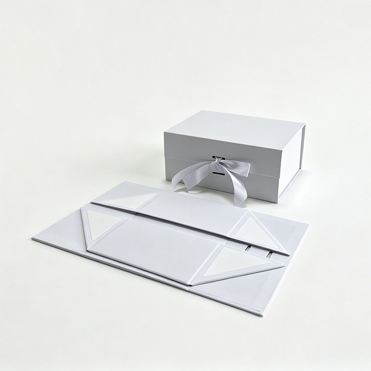
~について holographic cardstock printing, request an assembled sample as well as a flat printed sheet. Inspect text near scores, wrapped edges, and seams. Check for cracking, scuffing, and changes caused by the final varnish or laminate.
Through custom packaging samples and prototyping, specify which production materials and processes the sample must reproduce and ask the supplier to identify any substitutions.
Then move it. Read it under diffuse light and representative retail lighting, straight on and while tilted. Include readers who reflect the intended audience, including older readers where relevant.
My acceptance rule would be explicit: essential information must remain readable across the agreed conditions. If it fails, revise the opaque panel, text size, ink coverage, or layout before releasing the run.
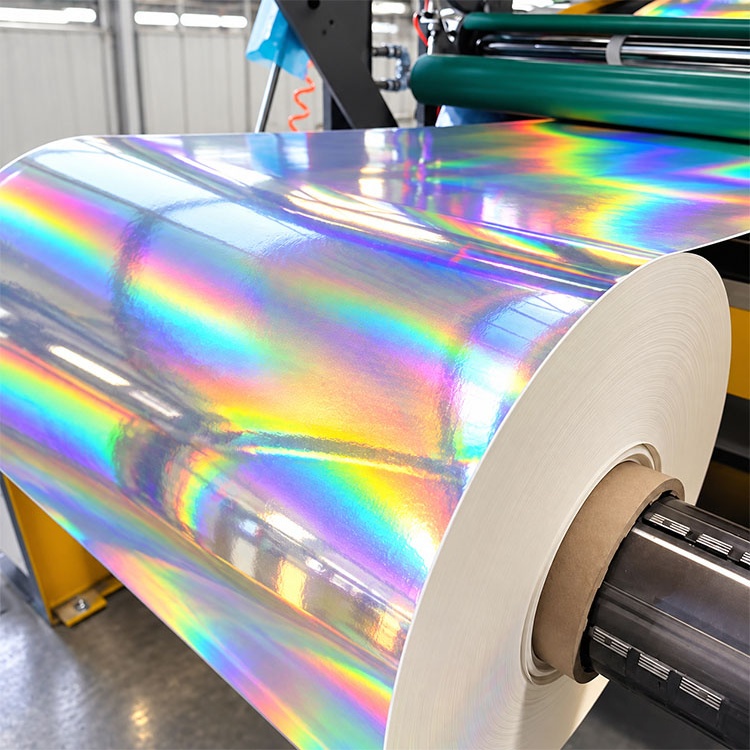
Holographic paper printing is the application of text and graphics to a paper or board substrate with a light-diffracting surface, using a compatible printing process and, where needed, opaque white ink to control how strongly the reflective background affects the finished design.
The construction and coating determine which printing methods are suitable.
A white ink underbase for holographic printing is a separately printed opaque layer beneath selected colors or text areas that reduces the substrate’s visible contribution, helping create a more stable background for information that must remain readable while allowing other areas to retain their holographic appearance.
Use it selectively when the physical proof shows that contrast or color needs better isolation.
The best fonts for holographic paper are typefaces with clear letter shapes, open counters, adequate spacing, and strokes that reproduce reliably at the intended size, with regular or medium versions of Arial, Helvetica, or Source Sans 3 offering practical candidates for comparison on the actual printed material.
Choose the version that passes the physical reading test.
Text legibility on holographic paper is improved by increasing the visual separation between letters and their background, typically through an adequately opaque white panel, stronger type, larger lettering, and sufficient spacing, then checking the finished print under representative lighting and viewing angles before production approval.
Start with the least readable essential text and revise until it passes the agreed conditions.
Send your dieline, artwork, smallest text size, intended holographic effect, order quantity, and delivery requirements when you request a holographic packaging quote from XD Packaging.
Ask for a physical comparison of the proposed white-ink variants, an assembled sample, and itemized sampling and production costs. Approve the combination you can read under the agreed lighting, then retain that sample as the production reference.