



See how much a white ink underbase changed measured color on brown kraft and what to check before approving your packaging print run.
Brown shows through. When you’re printing on kraft paper, the brown surface reflects light back through translucent process inks, so a blue that looked clean on white board can come out duller on the finished box even when the printer uses the same CMYK values. What are you approving if the proof leaves out the paper?
In direct full-color printing on kraft paper, the unprinted brown stock serves as the lightest tone. Pale tints leave more of that base visible, so I’d check product-photo highlights and the lightest brand colors first. If the design depends on those tones, compare physical swatches of natural brown and bleached kraft paper.
For corrugated packaging, specify which outer liner carries the graphics. That’s the print surface you need to see on a proof for custom printed kraft mailer boxes.
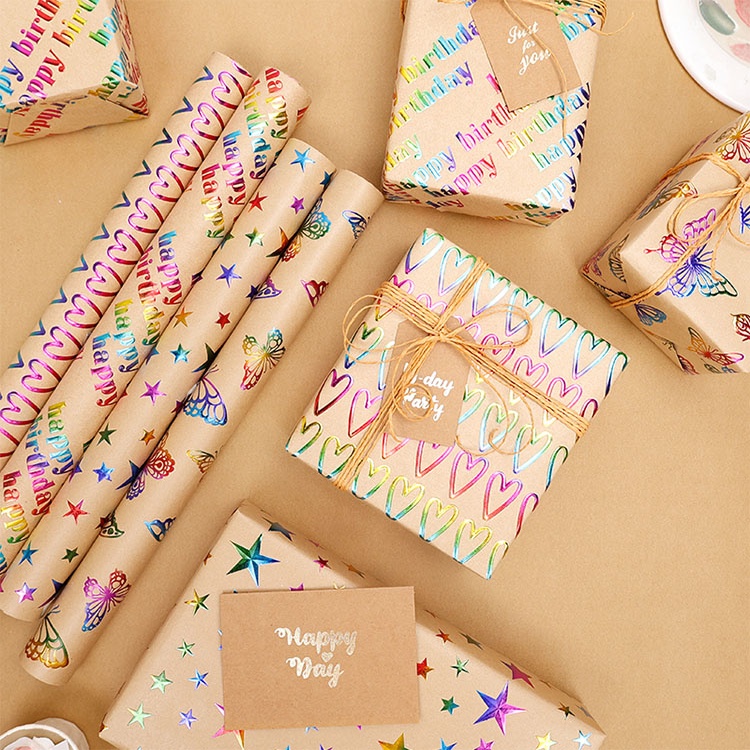
A white ink underbase is printed before the color to mask the brown where it would interfere with the design. If I were approving a kraft coffee carton with a black logo and a pale mint flavor code, I’d test the logo on bare kraft and put white under the mint. The customer still sees the brown fibers across the rest of the carton.
In 2015, a Clemson University team used a Roland VersaUV inkjet to print test charts on uncoated recycled kraft board. It compared the kraft print profiles with a clay-coated board reference using CIEDE2000 color difference (ΔE₀₀) under D50/2° conditions. The figures come from the Clemson team’s kraft paperboard printing trial.
| Kraft print setup | Mean ΔE₀₀ vs. clay-coated board | Standard deviation |
|---|---|---|
| Direct print on bare kraft | 13.58 | 6.15 |
| Kraft with one layer of white ink | 10.16 | 5.23 |
| Kraft with two layers of white ink | 4.19 | 2.30 |
Lower ΔE₀₀ means a closer measured match. These are chart averages for one board and press setup, so ask for a separate reading on each color you’ll sign off on.
White ink often gets its opacity from titanium dioxide (TiO₂). Increasing white ink opacity from 42% to 49% shifted the tested colors by 2.0–2.7 ΔE₀₀ in a 2023 flexography study on 20 µm clear PET film.
On kraft, ask your printer to show what the extra pass buys you on the actual board and quote it separately. At an illustrative US$0.04 per box, that pass adds US$200 to a run of 5,000 before any setup charges.
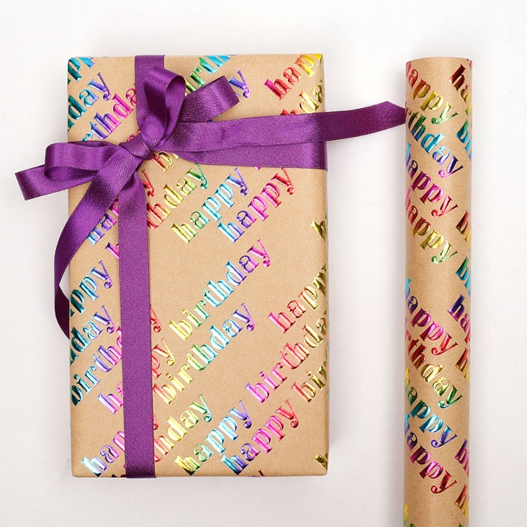
CMYK builds photographs and gradients from cyan, magenta, yellow, and black. A Pantone spot color uses a separately mixed ink, which is worth testing when one brand shade carries the design. The U in Pantone 100 U refers to the guide’s uncoated paper. The ink’s appearance still depends on the sheet it’s printed on, as Pantone explains in its coated and uncoated swatch guide.
Ask for a spot-ink drawdown, a swatch applied to the actual kraft stock. If the drawdown misses the target, test it over white. Give prepress the target swatch and specify where the white layer belongs in the packaging artwork and print files.
For kraft paper color matching, I’d approve layout and text in a PDF and reserve color sign-off for a printed packaging sample. Put these three items on the approval sheet.
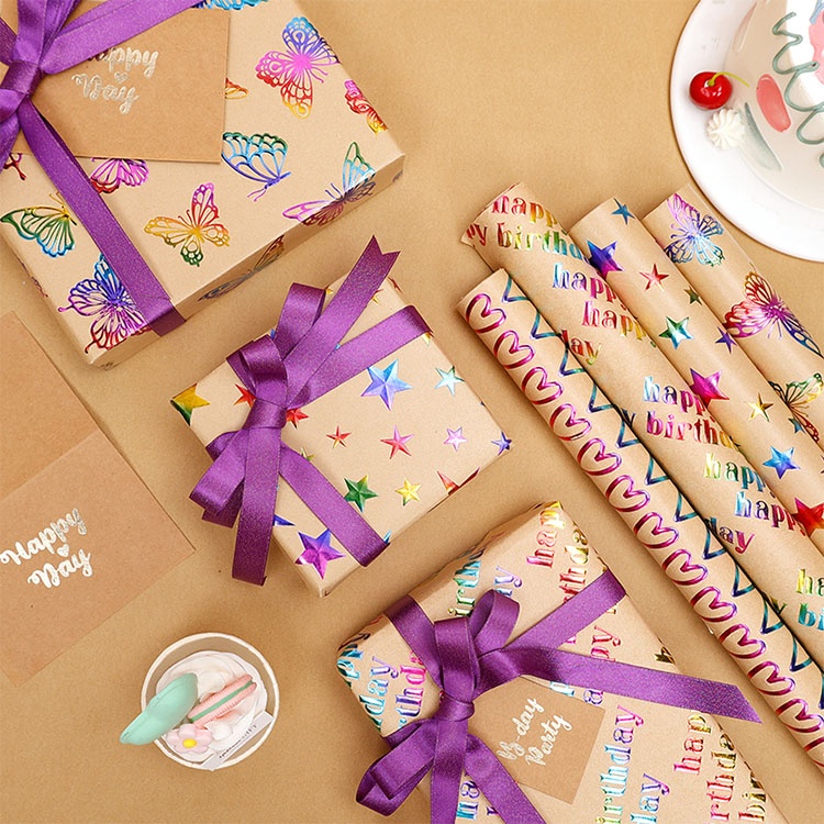
White printing on kraft paper requires a separate white ink or toner channel because standard CMYK contains only cyan, magenta, yellow, and black, so a 0/0/0/0 object in the artwork leaves the brown stock visible unless prepress assigns it to a dedicated white separation.
The best colors to print directly on brown kraft paper are usually black, deep navy, and other dark shades that give small type and simple graphics enough contrast against the stock, with final legibility depending on the shade of kraft, the press, and the size and weight of the lettering.
Two runs on the same brown kraft grade can look different because of lot variation, a shift in the paper’s base shade from batch to batch that remains visible through translucent process inks and can change the printed result even with identical CMYK files and press settings.
Send your artwork, box dimensions, quantity, preferred kraft stock, and the brand colors you need to match. Ask for one sample panel showing the same colors on bare kraft and over white, and agree on which swatch will serve as the production reference. Request a kraft packaging sample and quote from XD Packaging.